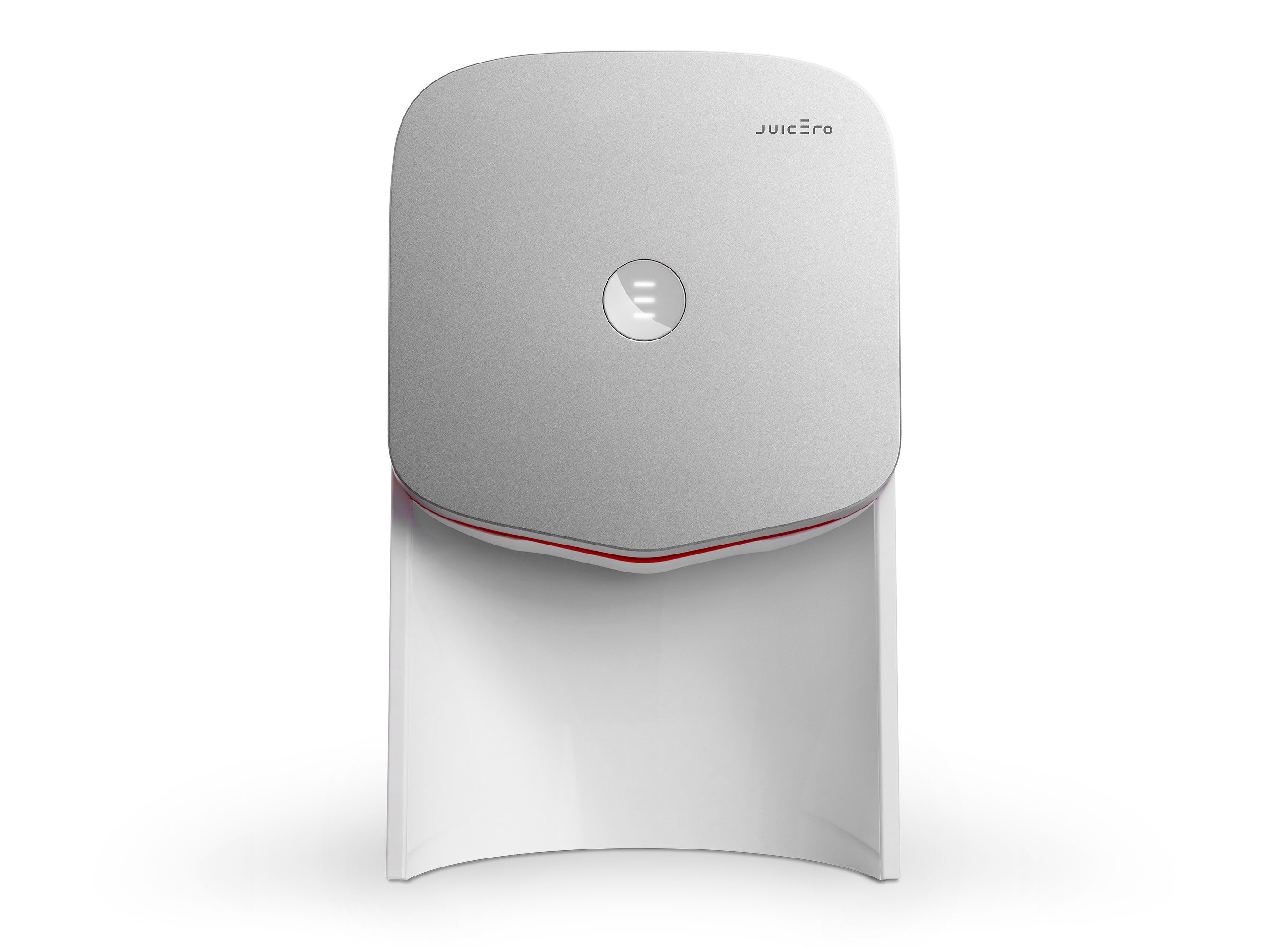
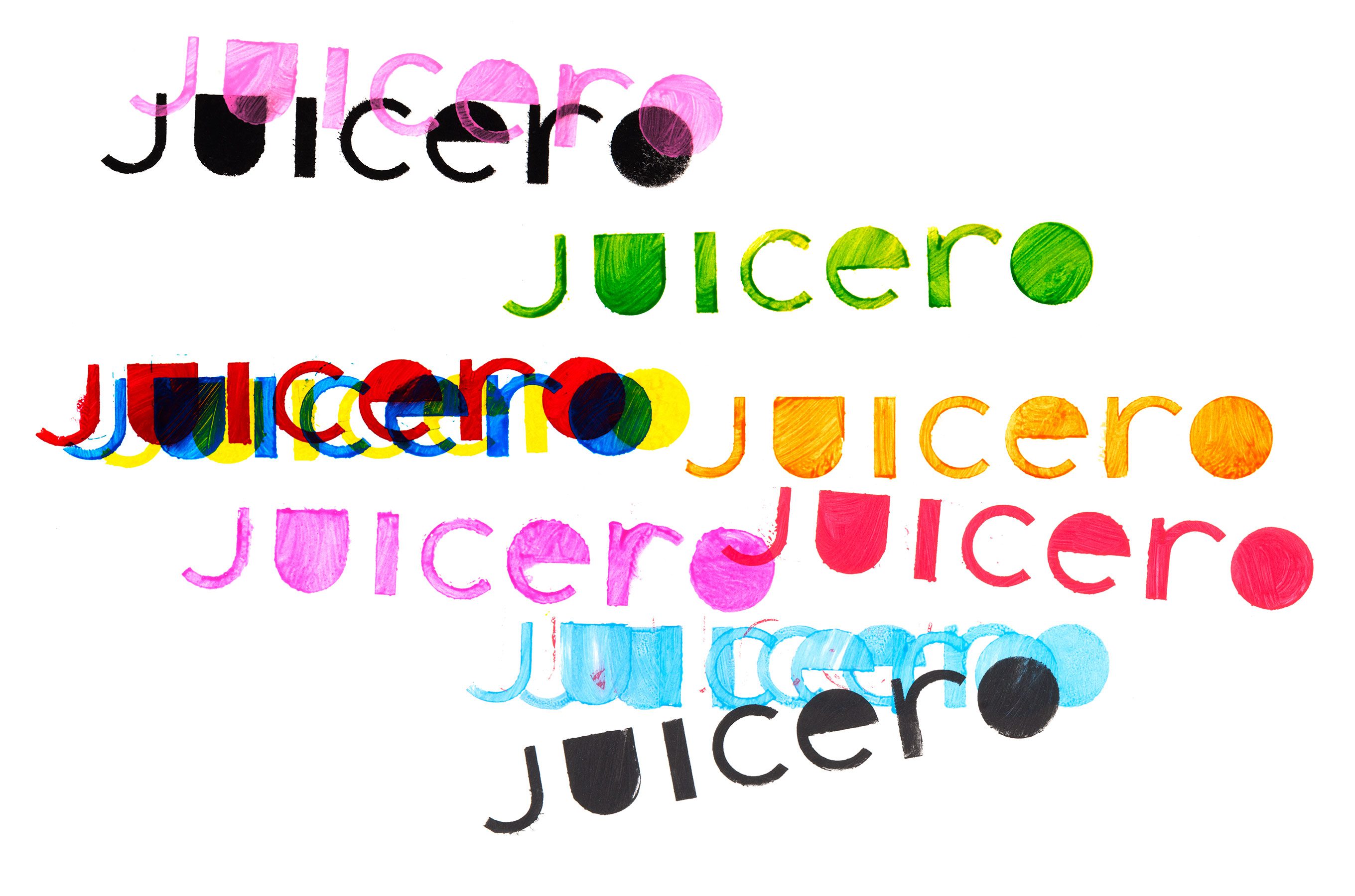
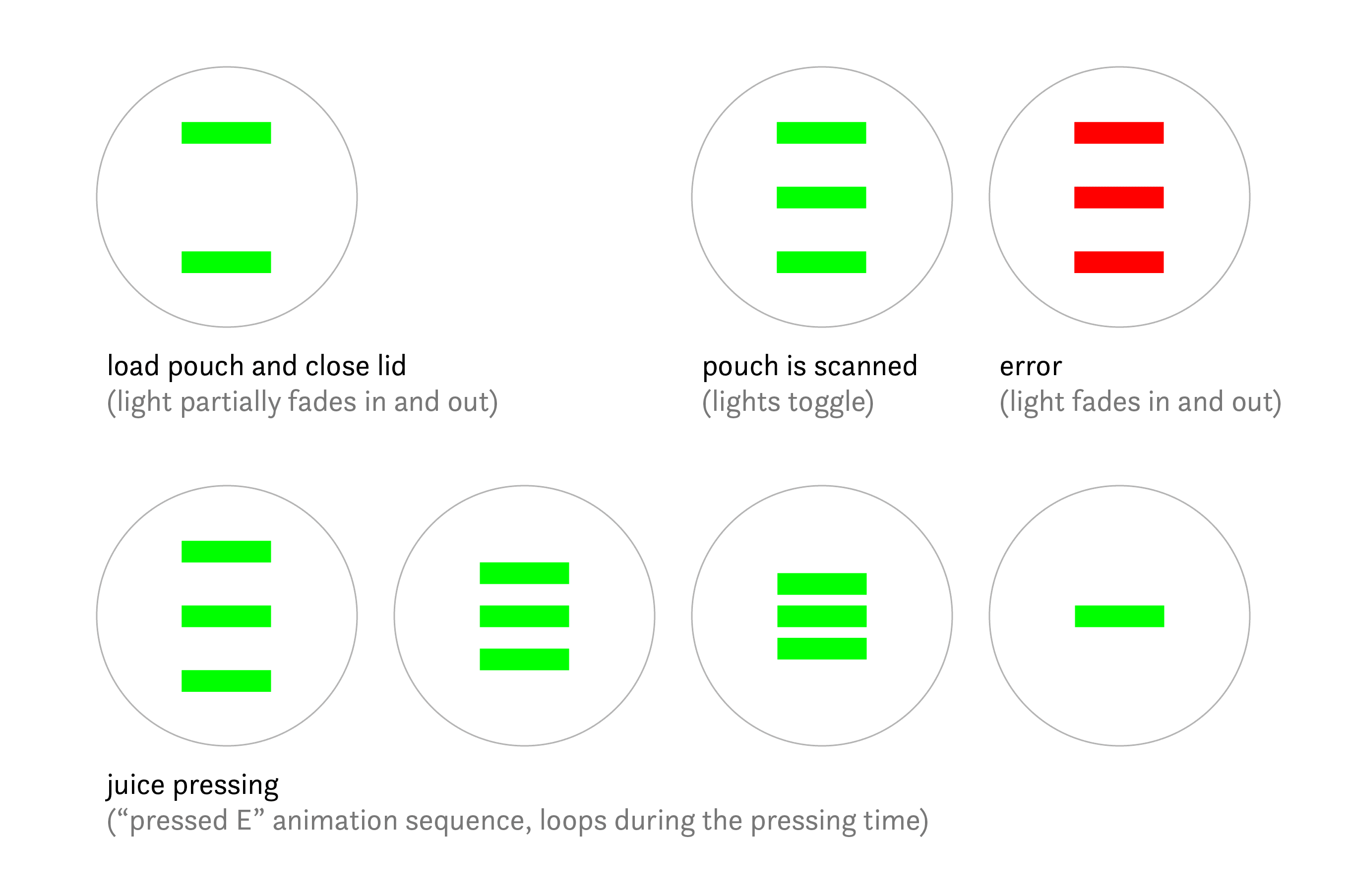
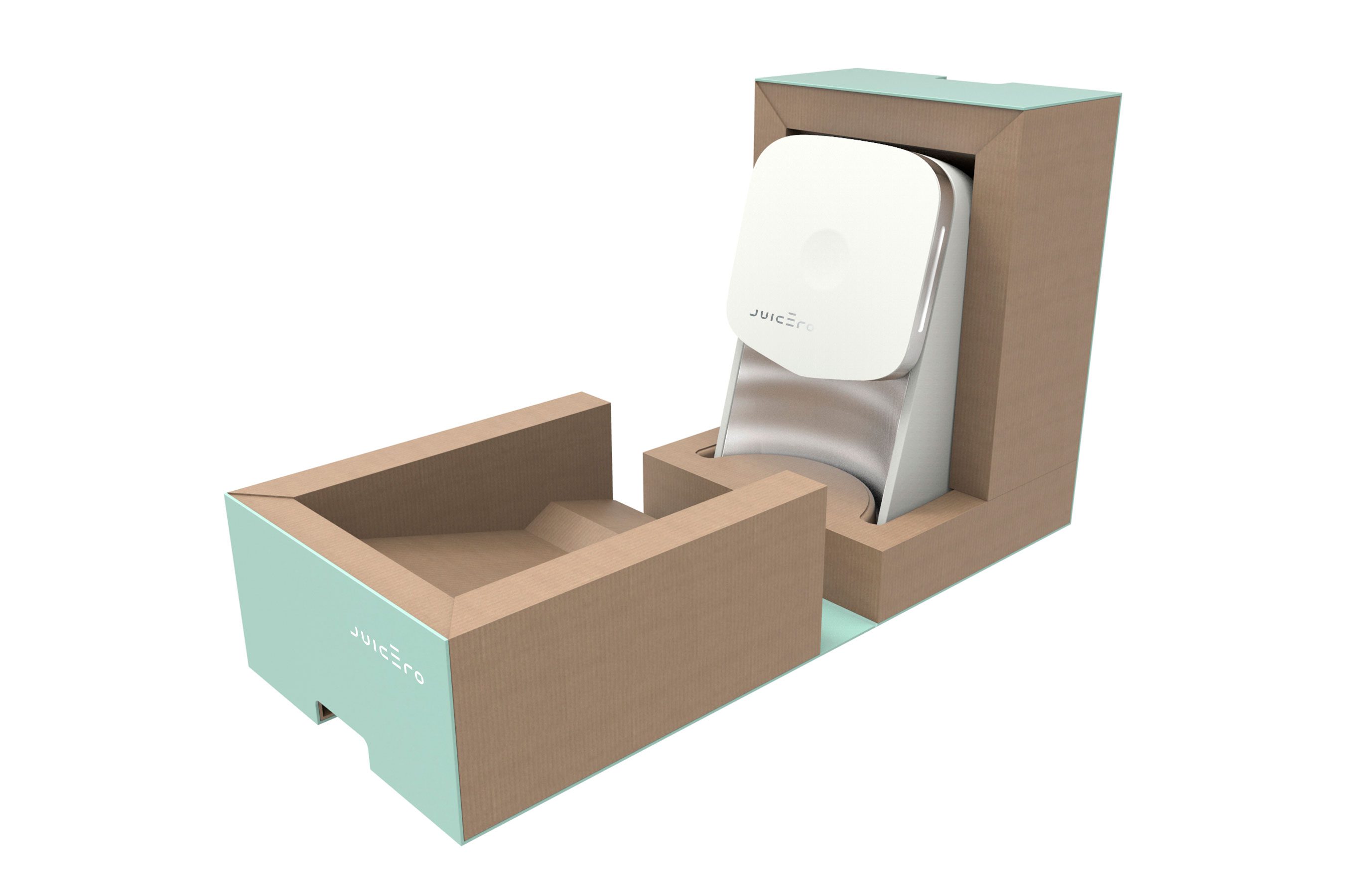
Brand identity and visual language for Juicero, the first at-home cold-press juicing system. One of my insights was to imbue the Juicero logotype with an unusually oversized minimal capital letter “E” which serves multiple functions: it is a kinetic device reminiscent of a press action; its top line functions as an accent mark reinforcing proper pronunciation; it is also the main mnemonic feature of this very modern identity program.