





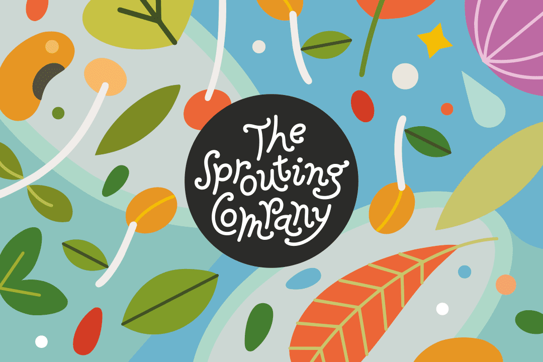
Branding for a startup that empowers people to easily and affordably grow the most nutritious food on the planet right on their kitchen counter. Bursting with abundance and brimming with sunshine, The Sprouting Company’s optimistic visual language is a whimsical ode to growth.
Author: Baruch Gorkin
The Book of Jewish Knowledge
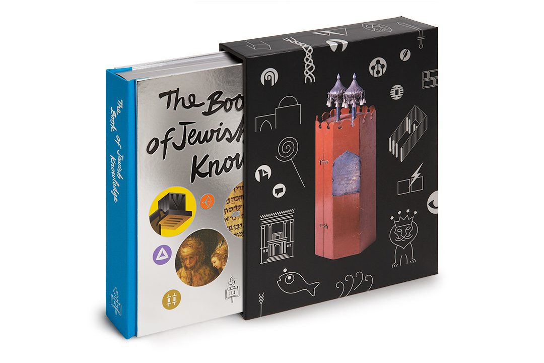
The full splendor of Judaism presented through a rich mix of texts and visuals. I was responsible for the creative direction and design of the book, from the slipcase-cover ensemble to the smallest icon, from artwork curation to material choices. The result is a multi-sensory excursion through labyrinths of time and layers of data, with the reader always in charge of their experience.
Open Book Torah
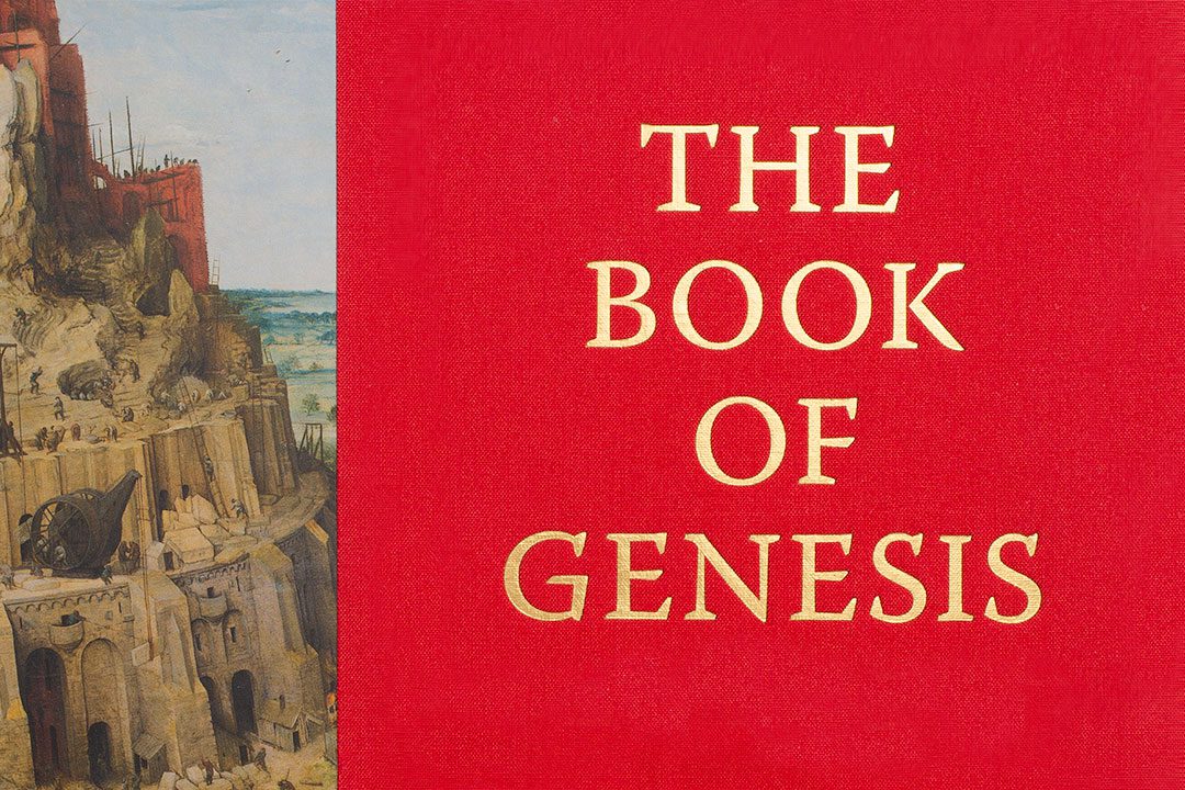
This project is about making ancient texts relevant to the modern reader. The book’s design reflects the Open Book Press editorial goal of affording the contemporary English reader an authentic Torah-learning experience, complete with its inherent contradictions, joys of discovery, and opportunities for insight. This undertaking included addressing the challenges of the by-lingual/by-directional typography, complex data visualization, and even the creation of a custom font.
Honcker
Honcker is the first company to introduce white-glove car leasing via an app, making the experience of car leasing completely seamless. It is all about bringing together modern digital technology and old-world customer service. The branding and UX work I shepherded for Honcker reflects those values.
Juicero
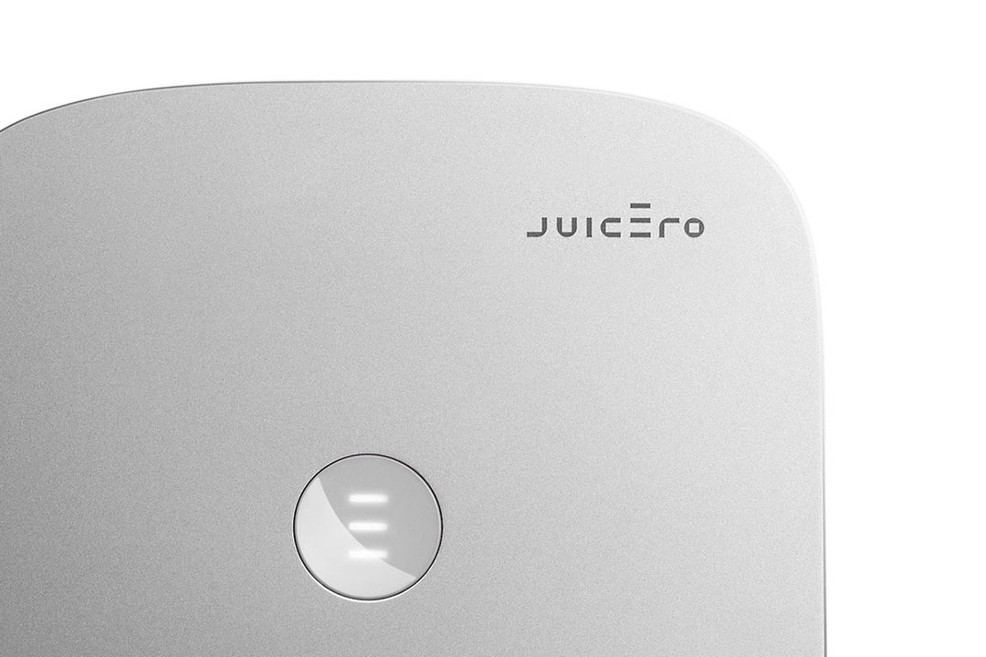
Brand identity and visual language for Juicero, the first at-home cold-press juicing system. One of my insights was to imbue the Juicero logotype with an unusually oversized minimal capital letter “E” which serves multiple functions: it is a kinetic device reminiscent of a press action; its top line functions as an accent mark reinforcing proper pronunciation; it is also the main mnemonic feature of this very modern identity program.
The Scroll
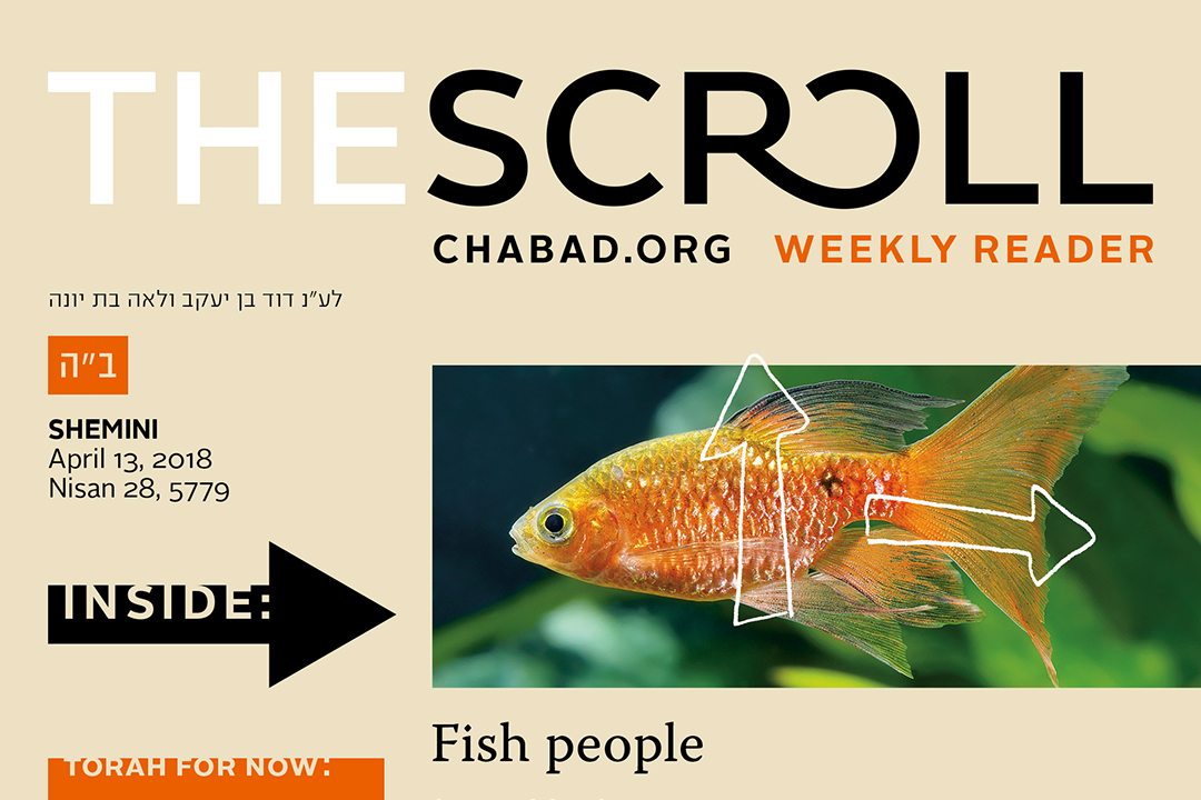
Format design, branding, and the multi-year ongoing creation of the editorial artwork for a weekly printed reader companion of the world largest Judaic content site. The attitude projected by the design and the artwork is not didactic and obvious, but visually playful, unexpected, and thought-provoking.
Apple / Microsoft fonts
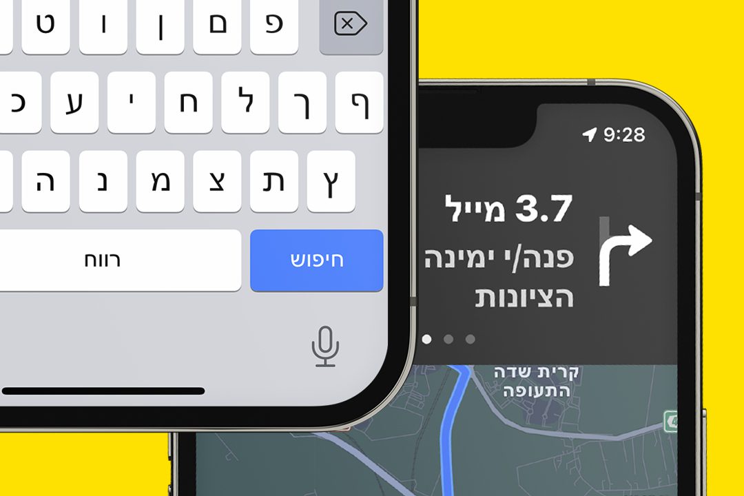
International system software Hebrew fonts designed to work in harmony with Latin counterparts. Three complete type families that ship with every Windows and Apple system software were developed. Shown here are fonts from the Arial Hebrew family, which won the international type design award from the New York Type Directors Club.
Organic Avenue
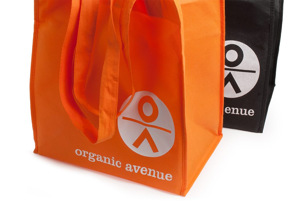
Branding for a pioneering New York City purveyor of cold-pressed juice, raw vegan food, and green living accessories. The Organic Avenue bright orange tote bag sporting a large modern “OA man” symbol became a recognizable statement on the city streets in support of a healthful and sustainable lifestyle.
CHP Bible branding

This branding for a biblical book series pays homage to the traditional Jewish ceremonial art and reinterprets the Torah Crown and the Eternal Light into contemporary and versatile branding devices capable of functioning as visual underpinnings of every part of these books — from cover to cover.
New Year Greetings

In what has become an eagerly anticipated New Year tradition, I take a yearly stab at exploring the endless opportunities for typographic puns presented by a simple set of numbers. https://isport.co.il/catalog/creator/eveelaurynn/